Mastering Color Models: Pantone, CMYK, and RGB for Custom Notebooks
Explore the dynamic world of color models essential for custom notebook design: Pantone (PMS) ensures unmatched color precision, CMYK excels in print material diversity, and RGB brings vibrancy to digital displays. Understand how these models shape the aesthetics of custom notebooks, offering unique benefits for distinct applications.
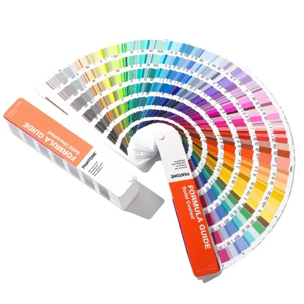
1. Exploring the Pantone Universe in Notebook Design
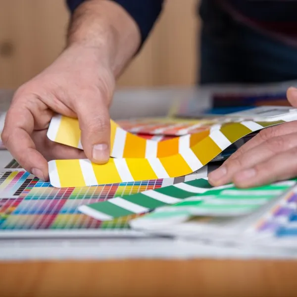
Delve into the Pantone Matching System (PMS), the cornerstone of color precision in notebook design. Pantone's PMS surpasses traditional printing, especially in rendering challenging shades like orange and green.
Key Features of Pantone in Notebook Design
Precise color identification through PMS.
Production of distinct ink colors tailored for challenging hues.
Comprehensive color swatch book, offering a spectrum of choices.
Essential for achieving exact color matches on specialized notebook materials.
Two Pantone Systems: Packaging Design and Product Design, each curated from 13 primary colors for maximum relevance in the market.
Pantone's Dual Approach
Packaging Design System: Focused on striking colors for retail impact.
Product Design System: Tailored for subtler, nuanced notebook aesthetics.
Both systems are designed to ensure color fidelity across various materials, providing designers with a versatile palette for any notebook project.
Pantone’s Palette Versatility and Practical Applications
Pantone’s diverse palette range caters to specific material needs in notebook design, offering solid, process, textile, and plastic palettes. This selection ensures each color choice is perfectly suited to the chosen substrate.
Tailored Pantone Palettes
Solid Palette: For vibrant and consistent color on solid materials.
Process Palette: Ideal for complex color blending in process printing.
Textile Palette: Specialized for fabric-based notebook covers.
Plastic Palette: Ensures color accuracy on plastic surfaces.
Implementing Pantone in Notebook Design
Pantone excels in replicating precise brand colors, from bold logos to intricate designs. Its superiority over CMYK in color depth and vibrancy makes it a preferred choice for high-end notebook branding. However, this precision comes at a higher cost.
Cost Considerations and Branding with Pantone
Pricing is influenced by color range and coverage area.
Essential for representing brand identity accurately on notebooks.
Complementary CMYK and RGB alternatives facilitate versatile branding across different mediums.
Pantone’s Edge in Notebook Branding
Unmatched accuracy in color reproduction, essential for brand logos.
Captures the depth of saturated colors and the finesse of metallic hues.
A popular choice for defining colors in official merchandise, including national flags.
An invaluable asset for premium corporate stationery and luxury notebook lines.
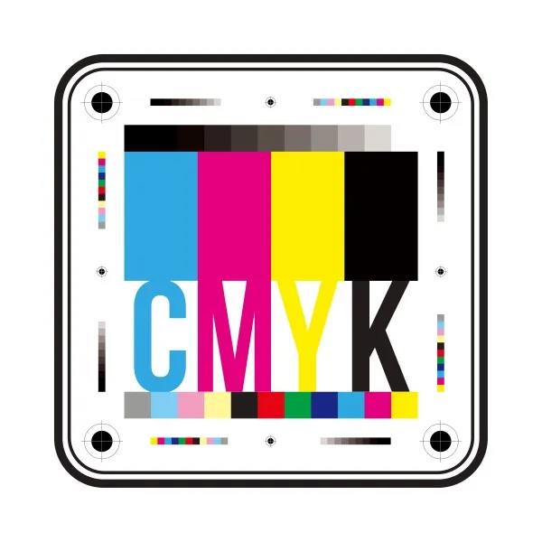
2. The CMYK Color Model in Custom Notebook Production
CMYK, a cornerstone in print production, uses four ink colors (Cyan, Magenta, Yellow, and Black) to create various shades. This subtractive color model is pivotal in notebook production, offering a distinct approach from the RGB digital model.
Key Aspects of CMYK
Subtractive Color Model: Mixes inks to subtract light, ideal for tangible products like notebooks.
Ink Dilution: Necessary for producing lighter, pastel tones in notebook designs.
Alignment: Precise 'keying' of CMYK plates ensures sharp, clear imagery.
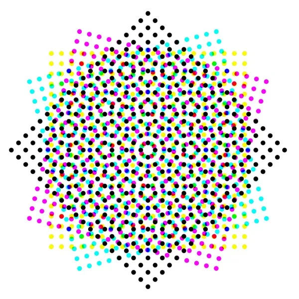
CMYK in Practice: Creating Diverse Shades for Notebooks
Halftoning Technique: Essential for blending CMYK colors, creating a spectrum of hues by varying dot sizes and spacing.
Applications: CMYK is the go-to choice for commercial printing, including custom notebooks, where color fidelity on paper is crucial.
Advantages in Notebook Production
Versatility: Adapts to various paper types and textures, ensuring consistent print quality for notebooks.
Photorealism: Excellently reproduces images and graphics, enhancing visual appeal in notebook designs.
Color Range: While not as extensive as Pantone, CMYK covers a broad spectrum suitable for most notebook applications.
Considerations for CMYK in Custom Notebooks
Color Limitations: Less vibrant than RGB; Pantone offers a wider range but at a higher cost.
Printer Variability: Colors may vary slightly across different printers, impacting the uniformity in large notebook orders.
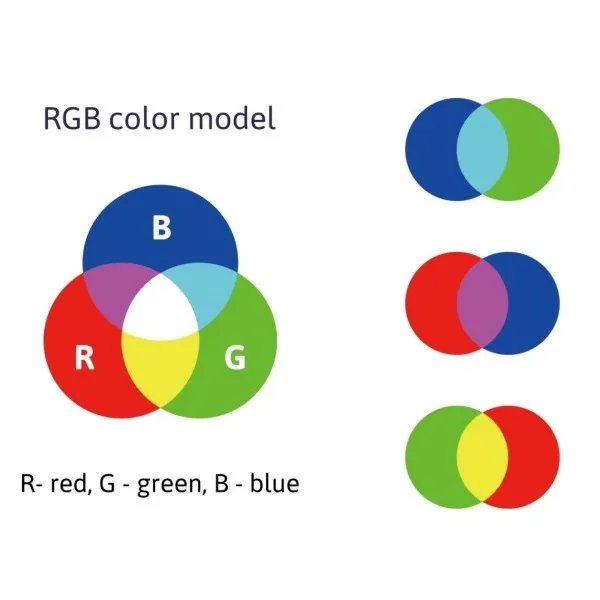
3. RGB Model - Digital Brilliance for Custom Notebooks
The RGB color model, fundamental for digital displays, is based on Red, Green, and Blue light. This model is instrumental in the design phase of custom notebooks, particularly in digital mockups and online previews.
RGB's Role in Notebook Design
Additive Color Process: Combining light to form colors is crucial for accurate digital visualization of notebook designs.
Wide Color Range: Offers extensive color variations for digital images, enhancing notebook design possibilities.
RGB in Digital Design: Crafting Vibrant Notebook Previews
Intensity Levels: Each primary color has six intensity levels, creating diverse shades for digital proofs.
Evolution: Advances in technology have refined RGB’s accuracy, ensuring that digital designs closely resemble finished notebooks.
Considerations for RGB in Notebook Production
Printing Limitations: RGB's vibrancy may diminish in print; conversion to CMYK for physical notebooks is necessary.
Color Adjustment: Transitioning from RGB to CMYK might require color tweaks to maintain design fidelity in printed notebooks.
Choosing the Right Color Model: Pantone, CMYK, and RGB
Comparative Analysis of Color Models
RGB for Digital Precision: Ideal for digital displays, RGB merges red, green, and blue light for vibrant on-screen visuals. Essential in the initial digital design phase for notebooks.
CMYK for Print Perfection: Utilizes cyan, magenta, yellow, and black ink, ideal for accurately translating notebook designs into print. Perfect for tangible notebook copies.
Pantone for Brand Consistency: Offers unmatched color precision in printing, ensuring brand colors are replicated flawlessly in notebook designs.
Strategic Color Model Application: Enhancing Notebook Appeal
Digital vs. Print: Understanding the nuances between RGB’s digital vibrancy and CMYK’s print fidelity is key for designers.
Pantone for Special Projects: When precise color matching is non-negotiable, Pantone is the go-to choice, especially for branding and high-end notebook editions.
The Impact of Color on Audience Engagement
Increased Readership & Comprehension: Referring to a Xerox study, strategic use of color can significantly enhance reader engagement and understanding. This insight is crucial in selecting color models for notebooks for marketing, educational purposes, or corporate branding.
Hi, I'm Su, the author of this post. I founded Interwell Stationery and have served over 1000+ clients since 2003. Feel free to contact us for custom stationery supplies, manufacturing support, and the latest trends in the industry.
Elevate Your Brand with Interwell's Custom Notebook Solutions
Unlock the power of color in your branding with Interwell Stationery. Our expertise in color models ensures your custom notebooks will capture attention and build brand loyalty. Contact us now to bring your vibrant vision to life.